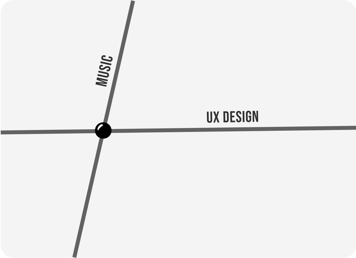
Where do I see an intersection between music and software design?

Collage work, remixes and mashups
As a musician and designer, I find myself cutting and pasting together parts of existing ideas to create something original.
Simplicity
Within both fields, there is a stage that involves omitting unnecessary elements. Keeping things simple leads to the best output.
Arjun, student with many passions.
As a teenager, I spent my free time shooting home videos, generating special effects on my '07 iMac and listening to hip-hop music. I have fond memories of being captivated by the visuals in music videos on TV.
Inspired and with a love for music, I created a prototype called the "contextual music visualizer".
With music, the context in which it was made/played cannot be forgotten. Do you feel nostalgic when you hear a particular song?
A Tribe Called Quest's music video for their famous 1991 hit "Scenario" inspired my idea for morphing today's music-player interfaces to relate to the time and technology in which a song was released, aiming to heighten the experience.
Displaying obsolete user interface elements for a 90's song or a fun Discman/Walkman interface for early 2000's music may truly transport the listener back.
Arjun, artist and designer.
(I still love music, although I've reincarnated as a creator rather than a listener).
I showcase the contextual music visualizer to celebrate my beginner's mindset. What was lacking to make this a portfolio piece?
This idea was something I personally wish existed in music streaming platforms. More work to gather feedback from potential users was necessary to assess usability and value to music lovers.
Songs I have released on streaming platforms.